So, a looong time ago I wrote a post about this "comic" idea I had which I would use pictures of my old Battle Beast figures and have the characters getting into various odd adventures.
Well, I finally got around to doing more than just thinking about it and I actually took a BUNCH of pictures and am now in the process of editing some of them.
Problem is... well.. the pictures aren't the best looking. You see, I thought the easiest way to do this would be to put up some green poster board on the top and bottom to work like a green screen and then add some blocks to raise the figures up a bit (after all they're pretty short), then go in Photoshop, delete the green screen and blocks, slap in a background, add some text, and viola!
Thing of it is though, like I said, the pictures aren't the best. Now, right now all I got access to is my Tablet and the camera on it isn't the best, but still... not expecting super sharp definition, but the big problem I'm having is the colors are "bleeding" a bit together. The green of the paper is merging with the figures (color cast? Is that what they call it?)
So, I'm curious if anyone who does photography might have some tips for better shots. Do I maybe need more lighting? Thinking maybe I should try doing these outside during the day for more natural light, but sometimes my schedule necessities working downstairs at night. Or maybe I need a different shade of green to get a better green screen effect. (Or perhaps cloth.) I once asked around about what color of fabric works the best, but didn't find a definitive answer.
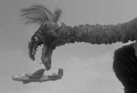
Here's some pics for visual representation.

So, yeah, if you look around the shoulder areas you can really see the green bleed through. I can color replace is in Photoshop, of course, but it's not perfect even then. Trying to see if there's a way to cut down on this altogether.

Here's a pic that still has the background. All I've done here is do the "Auto level correct" and shrink the picture.